Article
Choosing Colors for Branded Shipping Mailers
How to pick a mailer colour that still looks right after a supply chain has handled it, covering contrast, opacity, batch variation and photography.
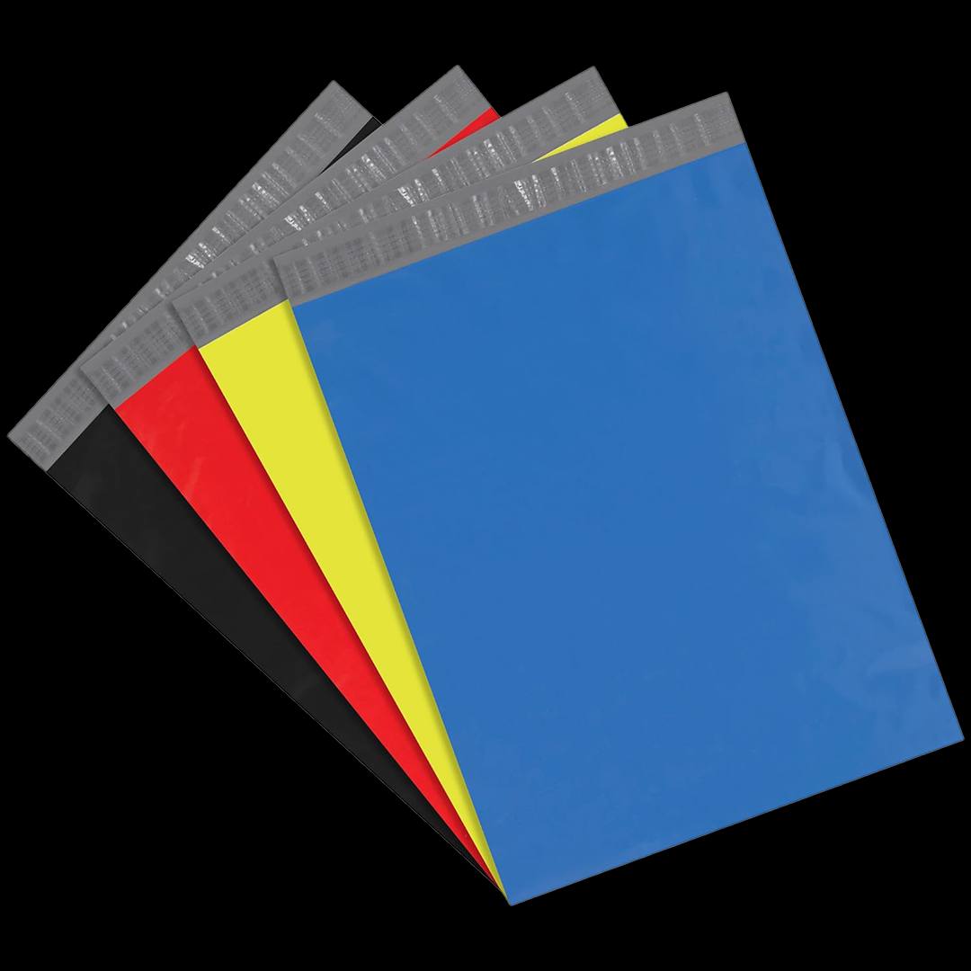
Packaging colour gets chosen from a swatch, in good light, on a desk. It then spends its working life in a warehouse, a van and a doorway, and a colour that looked considered on the desk can look grubby after a week in a sorting network.
Choosing well means thinking about the second environment rather than the first, and about four properties that are invisible in a swatch. The full range of stock tones is the starting point once those four are settled.
The four properties that decide it
Print latitude. The base determines which inks will read on it. White accepts everything, including photographic images and pale tones. Black accepts white and pale metallics and very little else. Everything between sits somewhere on that scale, and the constraint is absolute — no amount of print quality will make a dark mark read on a dark film.
Show-through. Pale films are translucent unless specified otherwise, and a dark product inside a blush or white mailer appears as a grey shadow through the panel. This is a specification question rather than a colour one, but it is decided at the same moment.
Mark visibility. Parcels acquire scuffs, conveyor marks and ink transfer. White shows all of it. Black shows almost none. This is cosmetic rather than structural, and customers photograph parcels, so cosmetic matters.
Photographic behaviour. Gloss produces hotspots that need lighting to control. Matte reads evenly under almost any light. Pale tones pick up the colour of whatever surface they are photographed on, which is why the same blush mailer looks peach on wood and mauve on grey.
All four are settled at quotation rather than left to the film that happens to be running, and the printing options that depend on them are settled at the same time.
What each family does in practice
- White and bone. The widest print latitude available and the lowest film cost. Shows every mark, and blows out under bright light in photographs. The right base for multi-colour or photographic artwork; a poor one for a parcel that will be handled a lot before it arrives.
- Black and charcoal. Fully opaque, hides marks almost completely, and makes white print sing. Narrow ink options, and it reads warmer or cooler depending on the finish more than any other colour.
- Grey and silver. An underrated middle ground. Hides marks well, accepts dark inks and white as a solid, and reads neutral rather than making a statement.
- Saturated brights. Maximum doorstep recognition and the strongest photographic subject. White and black print reliably on them; nearly everything else vibrates or disappears.
- Blush and pastels. The softest and most considered read, and the most demanding technically. Dark inks only, show-through is a real risk, and marks show more than on any base except white.
- Deep jewel tones. Read as premium, hide marks well, and take white and pale metallics. Frequently the most useful compromise between a black that feels severe and a bright that feels promotional.
The family that suits most brands first is the plain one — black mailers hide handling marks better than anything else on this list.
Deciding in the right order
Colour decisions go wrong when they are made before the questions that constrain them. Opacity and finish are film properties rather than colour ones, and the differences between film weights explain what each will support.
- Decide whether colour or print carries the identity. If the colour is doing the work, choose for recognition and you may not need printing at all. If print is doing it, choose for contrast against your ink instead.
- Check your primary ink against candidate bases. A brand built on a black wordmark cannot use a black base. Finding that out now costs nothing; finding it out at proof stage costs a week.
- Settle opacity against your contents. Dark products under pale film need higher opacity specified. This changes how the tone reads, so it belongs before the final colour choice rather than after.
- Choose the finish with the colour, not after it. The same pigment on matte and gloss looks like two different colours, and approving artwork before the finish is decided means approving it twice.
- Supply a physical reference. A screenshot is not a reference. A swatch, a previous sample or a defined colour value gives something that can actually be matched.
- Approve a proof on the real film. Colour reads differently on film than on paper, and differently again on a coloured base than on white.
Batch variation, and how to manage it
Colour drifts slightly between production batches, and it shows more on saturated tones than on pale ones. This is normal in film manufacture rather than a defect, but it becomes a problem in one specific situation: when a reorder has to sit on the same shelf as existing stock.
If that applies, say so at quotation stage and supply a sample from the run you are matching, or request a sample of the tone before the first order. It can then be checked against your reference before production rather than discovered on delivery.
If it does not apply — if you use stock down before reordering — the drift is invisible and not worth paying attention to.
The other cause of visible variation is storage. Prolonged light exposure affects colour on film, so a pallet stored by a window will not match the one at the back of the room. That is a storage discipline question rather than a supplier one.
Colour as an operational tool
Colour does work beyond branding, and this is the part that most businesses overlook.
Coding order types by mailer colour reduces picking errors at a busy bench without any printing at all. Gift orders in one colour, standard orders in another, and a packer can see at a glance that a parcel needs different handling.
The same applies to product lines in a mixed operation, to markets in a multi-country one, and to wholesale against direct. Colour is the cheapest visual signal available in a warehouse, and unlike a printed instruction it works at a distance and in peripheral vision.
That argues for choosing colours that are genuinely distinguishable from each other rather than tonally close, if you are running more than one. The guide to selecting a base colour sets the tones out by how far apart they read on a bench.
How many colours to run
More brands run more colours than they should.
Adding a second colour to an order is usually cheaper than expected, because setup is shared where the size, film and artwork match. What is not shared is everything afterwards: each colour is a line to store, a carton on the bench, a run-out date to track and a decision for a packer to get right.
Two tones with a defined purpose each outperforms five chosen because they looked good together. Decide what each colour is for before ordering it, and if you cannot answer that, it is stock you will write off.
The operational cost of running several tones, and how to keep it manageable, is set out on the colored mailer page.
The practical shortlist
If you want a short answer rather than a framework, most brands end up in one of three places.
A dark base — black or a deep jewel tone — with white print, for anything that wants to read premium and needs to survive handling.
A saturated colour with no printing at all, for a business that wants doorstep recognition at the lowest possible cost.
Or white, for anyone whose artwork is photographic or multi-colour and who therefore has no real alternative.
The one to think hardest about is blush and pastel — the pale pink stock is the usual starting point. It photographs beautifully, it reads exactly right for several categories, and it demands more of the specification than any other choice — opacity, ink contrast and finish all have to be settled deliberately rather than accepted as defaults.
Questions this raises
Which mailer colour hides handling marks most effectively?
Black, then grey and mid-tone colours. White shows the most by a wide margin. A matte finish helps on any base, and a design that covers more of the panel hides more of the surface.
Can I match my exact brand colour?
A match is quoted against a physical swatch or a defined colour value and proofed before the run. Some tones cannot be reached on some films, and where that is the case it is better to be told before ordering than to receive an approximation.
Will a reorder match my existing stock?
Batches can drift, and it shows more on saturated tones than pale ones. If a reorder has to sit alongside existing stock, say so at quotation stage and supply a sample from the previous run.
Not sure which colour survives contact with a shipping label
Send us the shade you have in mind and what your label and artwork look like. We will tell you how it behaves on film and quote the run.