Protection
Personalized Bubble Mailers
Printing on a bubble mailer is a different problem from printing on a flat one, and it is the reason so many first orders come back looking softer and less sharp than the file that was sent.
The surface is not flat. It is a field of raised domes with valleys between them, and ink lands on both. Highlights collect on the raised areas and shadows collect in the valleys, so every printed element is broken up by a texture that was not in your artwork.
That does not make the format a poor choice for branding — printed bubble mailers are among the most memorable parcels a customer receives. It means designing for the surface instead of against it. This page covers how.
From$0.30per unit, indicative — your quotation is priced against your own specification
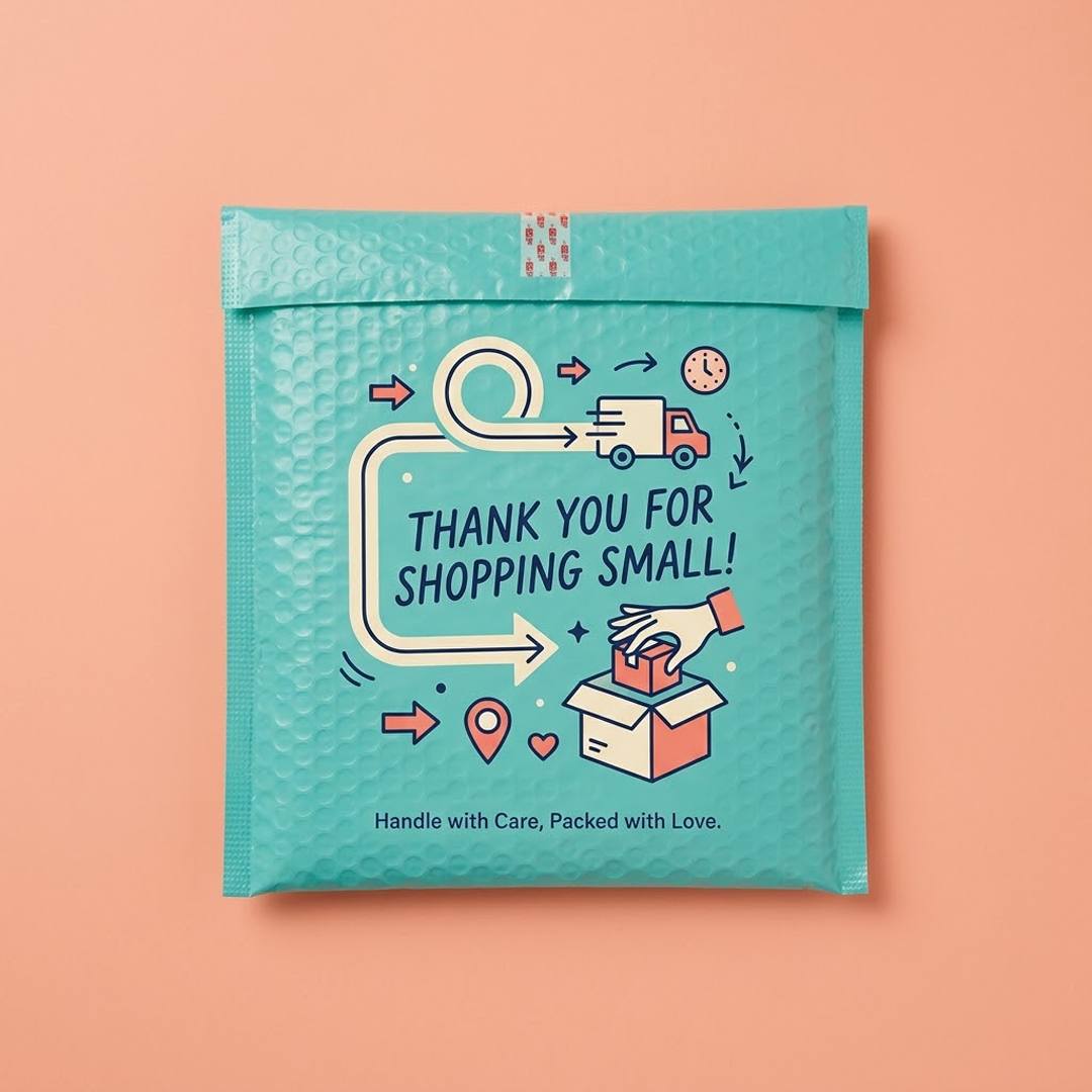
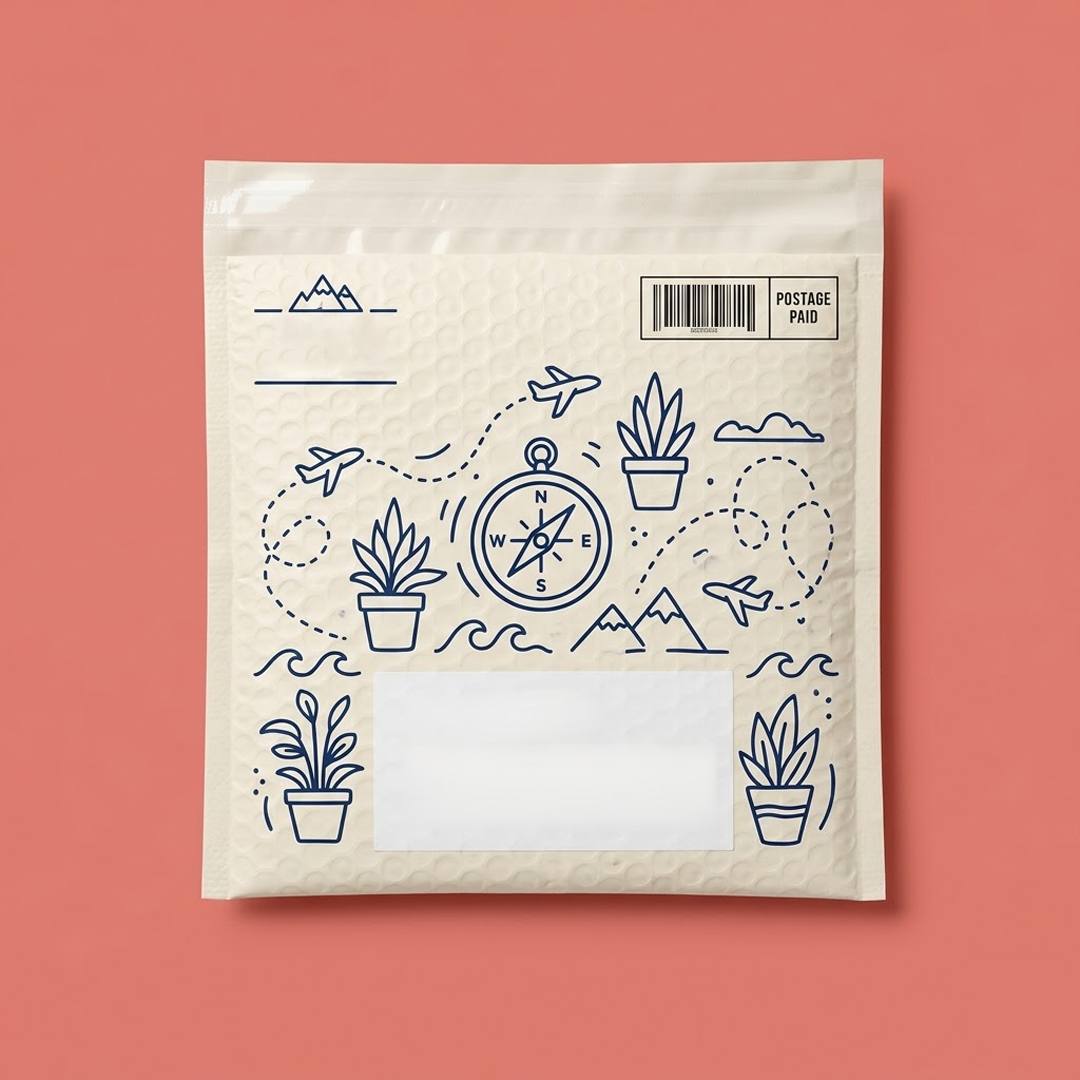
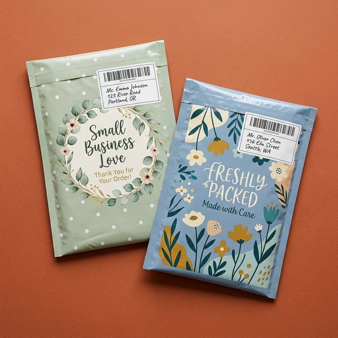
Price personalized bubble mailers
A short brief is enough to start. We come back with a written specification and a price.
What the texture does to artwork
Four specific effects, all predictable, all avoidable once you know about them.
Fine lines break up
A hairline rule crosses domes and valleys and reads as a dotted line rather than a solid one.
Small type loses its counters
The enclosed spaces in letters like a, e and o close up, and text below a certain size becomes a grey band.
Large solids look uneven
A flat area of colour reveals the dimple pattern as highlights and shadows, which reads as inconsistent printing even when it is not.
Gradients and photographs soften
Continuous tone needs a smooth surface to hold detail. On this one it goes muddy.
Designing artwork that works on this surface
Simplify deliberately rather than scaling an existing design up and hoping.
Increase every line weight
Take the thinnest element in your design and make it substantially heavier. If it looks slightly clumsy flat, it will look right on the bag.
Set type larger than feels necessary
Anything approaching body-copy size will not survive. Headline scale is the working minimum here.
Choose bold, simple shapes
Solid silhouettes and heavy marks read cleanly. Detailed illustration and fine ornament do not.
Use fewer colours, with strong contrast
One or two colours with real separation from the base outperforms a subtle multi-colour palette.
Plan a flat panel for the label
Leave a deliberate clear area. Labels adhere better to a plain zone and the design stays visible.
Approve a proof on the actual material
A flat proof does not show what the texture does. Ask to see it on the cushioned surface.
What survives the surface and what does not
A quick reference for a designer who has not worked on this format before.
| Element | On cushioned film | Recommendation |
|---|---|---|
| Bold wordmark | Reads well | Use it as the primary element |
| Solid icon or silhouette | Reads well | Scale up and keep it simple |
| Short message in large type | Reads well | One line, headline size |
| Body copy or care wording | Poorly | Move to an insert or a printed label |
| Hairline rules and borders | Poorly | Thicken substantially or remove |
| Photographic image | Poorly | Not suited to this format |
| Fine script lettering | Poorly | Substitute a heavier weight of the same face |
Why brands use this format anyway
The constraints are real, and the format is still one of the most effective branded parcels available. A printed cushioned mailer arrives feeling substantial, and the texture that fights fine artwork is exactly what makes the parcel feel considered in the hand.
It also reaches a customer at a moment of anticipation. A cushioned parcel signals that something worth protecting is inside, and a printed one turns that signal into recognition of who sent it.
The brands that get the most from it treat the bag as a poster rather than a page: one idea, large, in strong colour, with everything detailed moved to a card inside.
Print specification
Confirmed on your quotation, and proofed before anything runs.
| Option | Choices | What changes |
|---|---|---|
| Print coverage |
| Full coverage on a textured surface shows the dimple pattern; many brands prefer partial. |
| Colours |
| One or two strong colours generally outperform full colour on this surface. |
| Sides |
| The reverse suits a single large mark rather than information. |
| Base colour |
| A coloured base plus one strong ink is the most reliable combination here. |
| Label panel |
| A planned panel improves label adhesion and stops the design being covered. |
Options shown are the choices we can quote against. The exact specification for your order — including film weight, closure and print method — is confirmed in writing on your quotation.
Choosing the size before the artwork
Artwork is laid out for a specific panel, so changing size after approval means redrawing the file. Settle the size against your packed product first, then design to it. The construction and fit considerations that decide that size are set out on the poly bubble mailer construction page, which covers bubble grade and how fit affects protection.
Questions about personalized bubble mailers
Can you print full colour on bubble mailers?
You can, and it rarely gives the result brands expect. The dimpled surface breaks up continuous tone and reveals the texture in large solids. One or two strong colours on a coloured base produce a cleaner, more deliberate result.
What is the smallest type size that will read?
Nothing approaching body-copy size survives. Headline scale is the working minimum, and even then the counters in letters need checking on a proof. Care wording and instructions belong on an insert rather than on the bag.
Will a shipping label stick to a printed bubble mailer?
It adheres most reliably to a flat, unprinted panel. Leaving a deliberate clear area in the artwork improves adhesion and keeps the label from covering the design, which is why most printed bubble mailers are laid out with one.
Can I see a proof on the actual material before ordering?
Ask for it, and check the artwork on the cushioned surface rather than on a flat proof. A flat proof cannot show what the texture will do, and it is where most disappointment on this format comes from.
Print a cushioned mailer
Send your artwork and we will tell you honestly what will survive the surface, then proof it before anything runs.