Colour range
Light Pink Poly Mailers
Blush behaves nothing like hot pink. It is a low-saturation colour, which means it takes light differently, hides less, and asks more of both the film and the print.
The brands buying it are usually the ones treating packaging as part of a considered identity rather than as a signal flare: beauty, fine jewellery, boutique fashion, stationery. For them the tone has to be right, the film has to be opaque enough that a dark product does not shadow through, and the print has to hold up against a pale base.
Those three things are what this page covers, and they are why blush is quoted differently from a saturated tone.
From$0.30per unit, indicative — your quotation is priced against your own specification
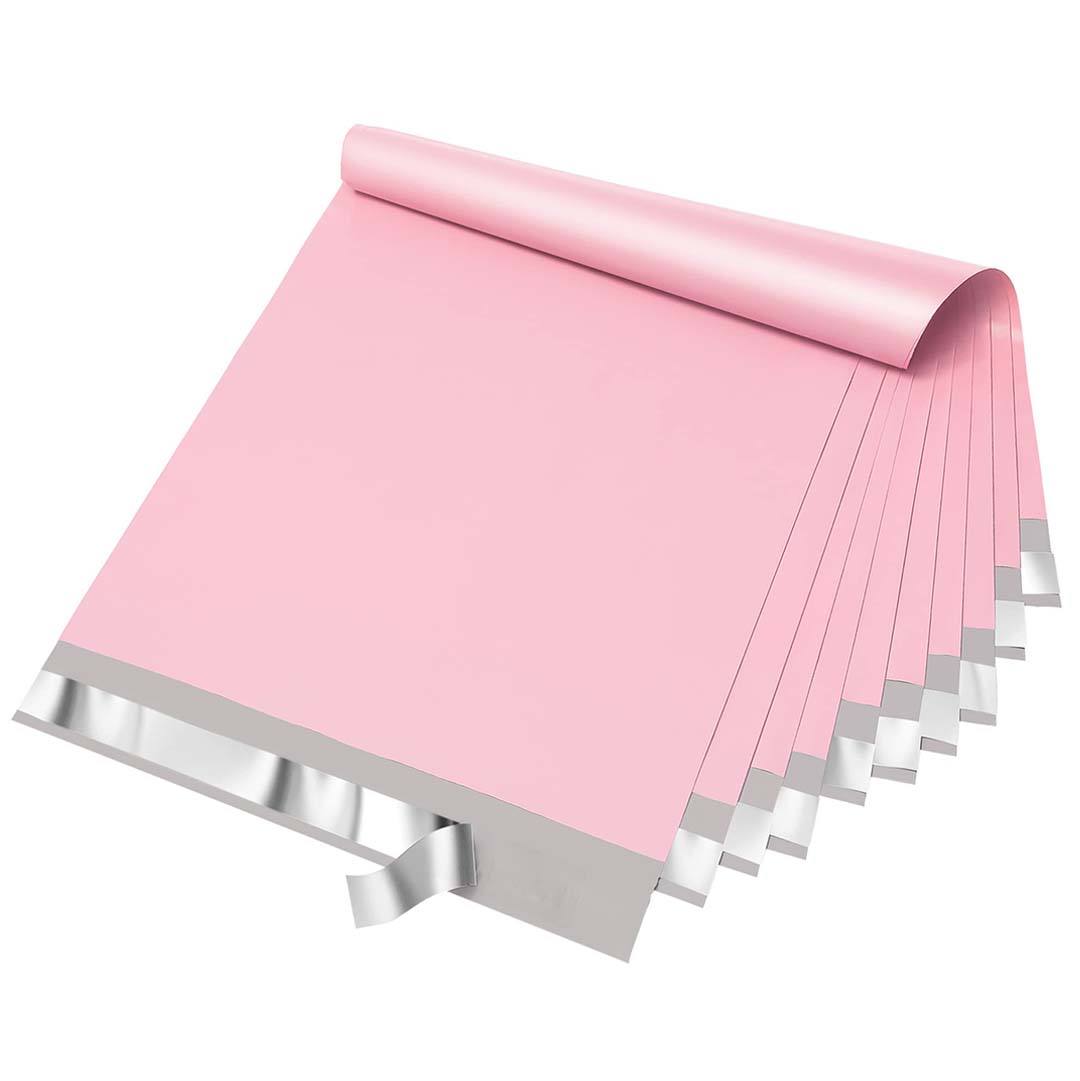

Price light pink poly mailers
A short brief is enough to start. We come back with a written specification and a price.
Opacity is the first thing to settle
Pale film is translucent film unless it is specified not to be. A black garment inside a standard blush mailer will read as a grey shadow through the front panel, and that shadow is what makes an otherwise considered parcel look cheap.
The fix is a higher-opacity film or a heavier film weight, both of which we can quote. It is worth deciding this before colour, because the opacity choice affects how the tone itself reads: the same blush on a denser film sits slightly cooler and flatter.
If most of what you ship is pale — cosmetics in white cartons, stationery, light garments — standard opacity is usually fine and there is no reason to pay for more.
Print contrast against a pale base
A blush base gives you far less contrast to work with than a saturated one. This is what survives at small sizes.
| Print colour | Legibility on blush | Notes |
|---|---|---|
| Black or charcoal | Very high | The dependable choice, and the one most blush ranges use. |
| Deep brown or aubergine | High | Warmer than black and reads as more considered at large sizes. |
| Deep rose or burgundy | Good | Tonal rather than contrasting; works for large marks, not small type. |
| White | Low | Nearly disappears. Usable only as a large solid shape, never as type. |
| Metallic gold or rose gold | Variable | Reads beautifully in some lights and vanishes in others; proof it. |
| Pastels | Very low | Not enough separation from the base to hold an edge. |
If your identity is built on a white wordmark, blush is the wrong base and a saturated tone will serve you better.
Where blush is the right call
Beauty and skincare
Sits with the tones the category already uses on cartons and secondary packaging.
Fine jewellery and accessories
A quiet outer parcel keeps attention on the box inside rather than competing with it.
Boutique fashion
Reads as considered rather than promotional, which matters at higher price points.
Stationery and paper goods
Complements uncoated papers and muted print without clashing.
Gifting ranges
Looks like part of the gift, not like a shipping supply that has to be discarded first.
What to specify
Opacity and finish matter more here than on any other colour. All choices are confirmed on your quotation.
| Option | Choices | What changes |
|---|---|---|
| Opacity |
| Specify higher opacity if you ship dark or high-contrast contents. |
| Tone |
| Pale tones drift more visibly between batches, so a reference is worth supplying. |
| Finish |
| Matte is the usual choice — gloss pushes a pale pink toward looking synthetic. |
| Format |
| The same tone can run across both so a range stays consistent. |
| Dark ink on blush is the reliable combination; see the contrast table above. |
Options shown are the choices we can quote against. The exact specification for your order — including film weight, closure and print method — is confirmed in writing on your quotation.
Photography and content considerations
Pale packaging photographs differently from strong colour. Blush picks up whatever is around it, so a parcel shot on a warm wooden surface reads peach and the same parcel on a cool grey surface reads mauve. Teams shooting product content should settle their surface and lighting before ordering a matched tone, or the mailer will never look like the sample. Where a printed design is doing the identity work rather than the colour, the custom printed mailer options set out how coverage and method affect what is achievable.
Questions about light pink poly mailers
Will dark products show through a light pink mailer?
Through a standard-opacity blush film, usually yes — as a soft grey shadow. If you ship dark garments or dark cartons, specify higher opacity or a heavier film weight when you request a quote.
Is light pink the same as rose gold or nude?
They overlap and the terms are used loosely across the industry. That is why we quote against a reference rather than a name. Send a swatch or a sample and we will confirm what is achievable on the available film.
Can I print white on a blush mailer?
You can, but it barely reads. White on pale pink works only as a large solid shape and never as type or fine detail. Dark inks are the reliable route on this base.
Does blush come in bubble-lined mailers as well?
Yes. Running the same tone across plain and cushioned formats keeps a range consistent when some products need protection and others do not.
Quote blush pink mailers
Tell us what you ship and how dark it is, and send a tone reference if you have one. We will confirm opacity and colour before pricing.