Colour range
White Poly Mailers
White is the default for a reason that has nothing to do with looks. It is the base that accepts every ink colour, so a design that works on white will work; a design built for a coloured base has to be checked.
That latitude is what makes white the sensible choice for a first printed run, for a brand whose palette uses several colours, or for any design that includes photography or gradients. It is the least opinionated surface available.
It also shows every scuff a sorting network can inflict. This page covers both sides of that trade honestly, because for some ranges white is the wrong answer.
From$0.30per unit, indicative — your quotation is priced against your own specification
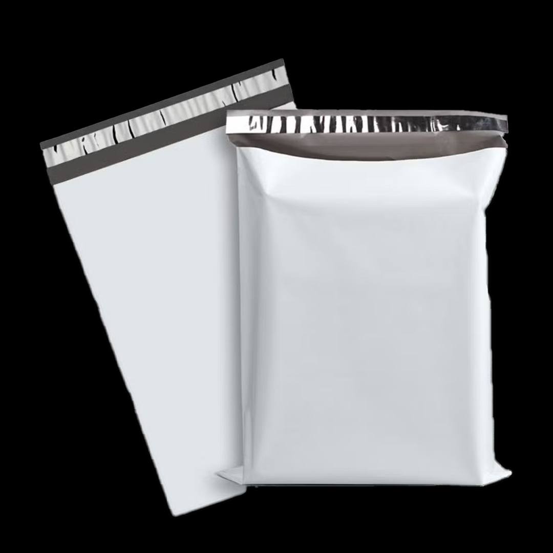
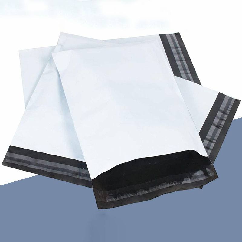
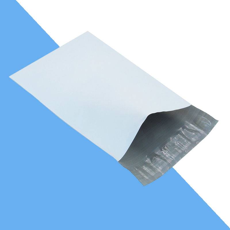
Price white poly mailers
A short brief is enough to start. We come back with a written specification and a price.
White against a coloured base
This is the decision the page exists to settle. Neither answer is right for everyone.
| Row label | White base | Coloured base |
|---|---|---|
| Ink colours available | All of them | Limited by contrast against the base |
| Photography and gradients | Reproduce properly | Rarely work |
| Doorstep recognition without print | None | Immediate |
| Shows scuffs and handling marks | Clearly | Much less, especially on dark tones |
| Cost of the film itself | Lowest | Small premium |
| Suits a multi-colour identity | Yes | Only if the palette works on that base |
A useful rule: if your identity is a single mark in one colour, a coloured base gives you more for less. If it is photographic or multi-colour, white is the only base that will carry it.
What white does to a printed design
On white film the ink you specify is close to the ink you get, because nothing is showing through from underneath. Gradients hold, photographic images reproduce, and pale tones in your palette stay pale rather than disappearing.
The one thing to watch is coverage. A large solid area of ink on white shows any inconsistency in lay-down more than the same solid does on a tinted base, because the eye has a clean reference sitting next to it. Where a design is mostly solid colour, a coloured film often produces a more even result for less money.
Where white is the right base
First printed runs
No contrast problems to solve, so artwork moves from file to proof without a redesign.
Multi-colour or photographic artwork
The only base that reproduces a full palette or an image reliably.
Ranges with several sub-brands
One film, different artwork per line, rather than a colour to manage for each.
Cost-led volume orders
The lowest-cost base film, which matters at high monthly volumes.
Operations that hand-write or apply large labels
White gives labels and pen the contrast they need.
Options on a white base
Selected by you, confirmed on the quotation.
| Option | Choices | What changes |
|---|---|---|
| Film weight |
| Heavier film also raises opacity, which stops dark contents greying the panel. |
| Opacity |
| Worth specifying if you ship dark garments, since a shadow is more obvious on white. |
| Finish |
| Matte disguises handling marks noticeably better than gloss on a white base. |
| Print coverage |
| Full coverage on white is where photographic and multi-colour designs belong. |
| Closure |
| Unchanged by colour choice, but worth setting at the same time. |
Options shown are the choices we can quote against. The exact specification for your order — including film weight, closure and print method — is confirmed in writing on your quotation.
Handling marks, and how to live with them
White shows what happens to a parcel on its way to a doorstep — conveyor marks, ink transfer from other labels, a grey line where it was gripped. None of it affects the contents, but customers photograph parcels now, and a scuffed white bag reads as carelessness. A matte finish helps materially. So does a design that carries visual interest across the panel rather than leaving large clean areas. If handling marks are a recurring complaint, the case for a dark base film is worth reading before you reorder.
Quality control on a white run
White film is the least forgiving substrate for a print check, which makes it the easiest to inspect properly. Registration drift, colour variation between the start and end of a run, and any speckling in a solid area all show clearly.
We check proofs against approved artwork at intervals through the run rather than only at the beginning, and hold samples against your approved proof rather than against a screen.
Questions about white poly mailers
Why are most poly mailers white?
Because white film is the lowest-cost base and the only one that accepts every ink colour. That combination makes it the default for both plain stock and first printed runs.
Do white poly mailers show dirt in transit?
More than any other colour. Marks are cosmetic rather than structural, but they are visible. A matte finish reduces how much they show, and a design that covers more of the panel hides more of them.
Will dark clothing show through a white mailer?
On standard-opacity film it can appear as a faint grey shadow. If you ship dark garments regularly, specify higher opacity or a heavier film weight when requesting a quote.
Is white cheaper than coloured film?
Generally yes, by a small margin, and matched colours cost more again. At high monthly volumes that margin is worth quantifying rather than assuming.
Price white mailers
Tell us the size, the quantity and whether you are printing. We will quote the film weight and opacity that suit what you ship.