Serving customers in the United States
Poly Mailers for San Antonio Businesses
A meaningful number of San Antonio businesses print packaging that speaks to customers in two languages, and it is a genuinely different design problem from printing in one.
Everything doubles: the wording, the space it needs, the proofreading. On a panel that was already tight, that changes what artwork can reasonably carry.
Quote an order for San Antonio
Tell us what you ship and where it goes. We confirm the specification, the schedule and the price in writing.
Who buys mailers here
Sectors where poly mailers are genuinely the right packaging, with the reason each one appears rather than a generic list.
Consumer goods and retail
Businesses serving a customer base that reads comfortably in either language.
Food and speciality products
Categories where product information on packaging matters most.
Direct-to-consumer brands
Own-channel businesses building an identity across both languages.
What we would suggest
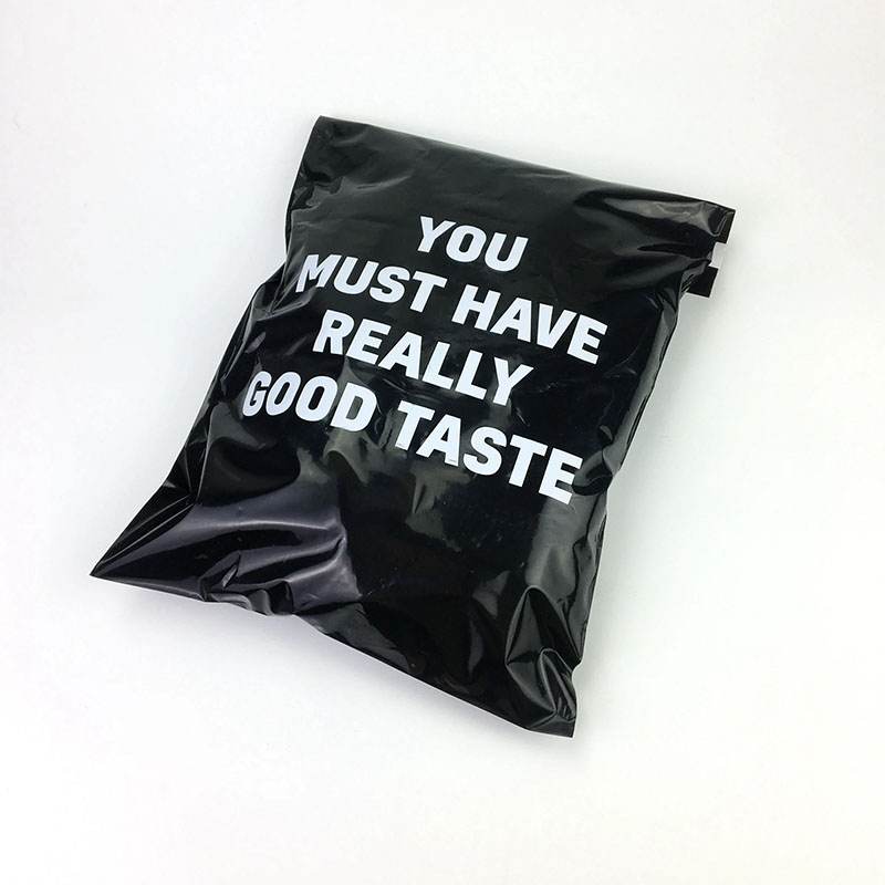
Custom Poly Mailers
Bilingual wording has to be printed rather than applied as a sticker if it is doing real work.
Read the detail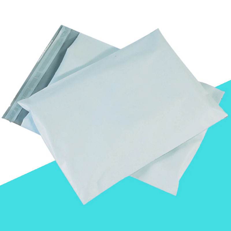
10x13 Poly Mailers
A larger panel is worth more when copy doubles.
Read the detail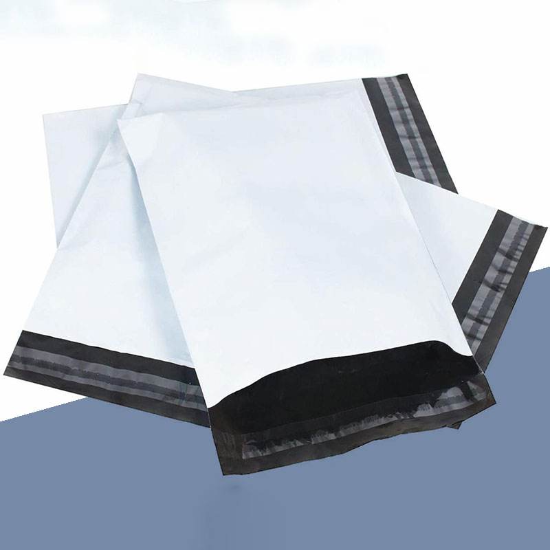
12x15 Poly Mailers
Where two-language wording plus a mark needs genuine room.
Read the detail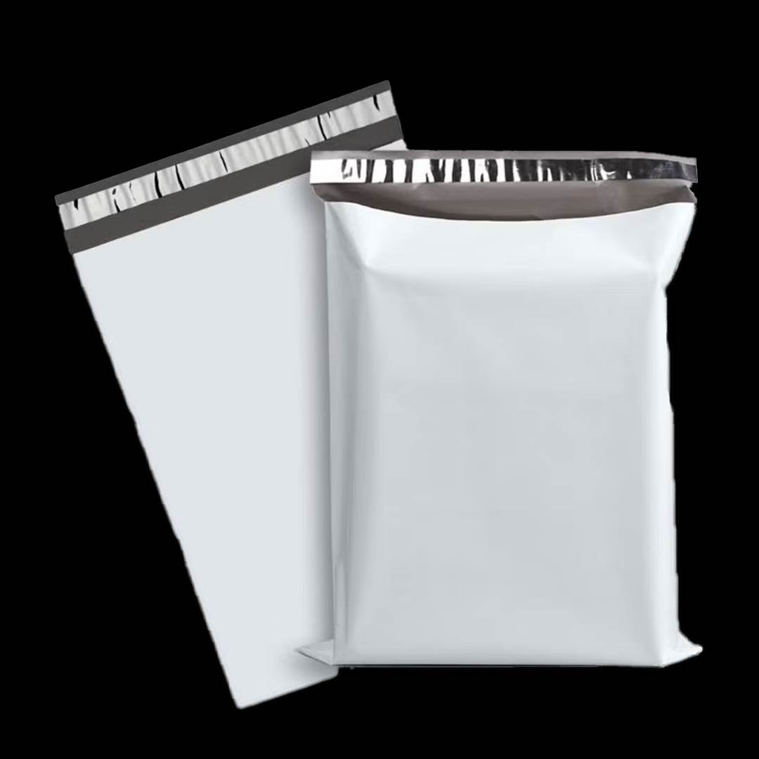
White Poly Mailers
The base with the widest ink options, which matters when text is doing the work.
Read the detailTranslation is not the same as voice
A translated slogan and a slogan that works are different things.
The instinct is to write the copy, translate it, and print both. What comes back is grammatically correct and frequently flat, because humour, rhythm and idiom rarely survive being converted rather than rewritten.
Packaging copy is short, which makes this worse rather than better. A thank-you line has almost no room to recover from an awkward phrase, and a customer reading in their first language notices immediately.
The businesses that do this well write twice rather than translating once. Same intent, same warmth, different words — and often different lengths, which is a layout consequence of a decision that started as an editorial one.
Deciding what actually needs both languages
Not everything on a bag has to appear twice, and treating it as though it does is what makes bilingual packaging feel crowded.
A brand mark
Does not translate and should not. It is the one element that stays exactly as it is.
A welcome or thank-you line
The strongest candidate for both languages, because it is the part doing relationship work.
Care and handling information
Often better as symbols, which carry meaning in either language and take a fraction of the room.
Returns and disposal wording
Worth both languages if a customer has to act on it, and worth moving to an insert if it runs long.
Marketing copy and social handles
Rarely need duplicating. A handle is a handle in both.
Cutting the list to what genuinely needs both is more effective than any layout technique, because the constraint on a mailer panel is space rather than design skill.
Who signs it off
The single biggest risk in bilingual packaging is not a design problem. It is an approval problem: copy approved by someone reading it in their second language, printed at volume, and read by thousands of people in their first. Name a native reader of each language as an approver before artwork starts, and treat their sign-off as a gate rather than a courtesy. We print exactly what is on the approved proof, which makes that approval the last line of defence, as set out on the ordering process page.
Questions from San Antonio buyers
Should I translate my packaging copy or rewrite it?
Rewrite it. Packaging lines are short, and humour, warmth and rhythm rarely survive translation intact. Writing the same intent twice produces something that reads naturally in both languages, which a converted sentence usually does not.
Does everything on the bag need to appear in both languages?
No, and assuming it does is what makes bilingual packaging feel crowded. Brand marks do not translate, care information often works better as symbols, and social handles read the same either way. Duplicate only what a customer has to act on or feel.
Who should approve the second-language copy?
A native reader, named as an approver before artwork starts. We print exactly what appears on the approved proof and have no way to know that a phrase is awkward, so that sign-off is the last check there is.
Print in two languages
Send both versions of your copy and we will show you a layout that keeps each readable at the size film can actually hold.